
Brand Strategy, Art Direction + Design
Deliveroo Editions
Food envy, we’ve all been there. Eyeing up a friend’s menu choice, queuing outside the latest Hackney pop up, saving places to eat on social from other cities. Enter Editions; Deliveroo’s first sub brand, curating a bespoke set of delivery-only restaurants for each neighbourhood.
Scroll ↓
Brand strategy
Initially coined “Roo Box” the sub brand needed some TLC before we launched; to be editorial and exciting, not functional. Editions would incubate new brands, allow seasoned restaurateurs to test new concepts and invite ‘chefs in residence’ from across global markets to swap cities, and to make city centre favourites available in the suburbs.


The playbook needed to flex for launches all over the world. We identified a key opportunity for a return to Deliveroo’s roots by getting hyper-local and co-create the zeitgeist with the customers.
The name Editions was chosen to reflect curation, something that could flex across brand touch points from local to global. We collaborated with local artists, restaurant owners and public spaces to ensure launches were meaningful to locals and attracted attention.
Design
The design approach needed to complement the core brand visual identity but with a twist on convention. As such, the logo uses the core brand wordmark. The container shape is a nod back to the original spirit of “Roo Box” while repeating the angular form language of the Roo mark found in the main brand.

Launch playbook – New restaurant upsell flyers
The stamp format was essential so it could stand alone confidently, be neutral enough to sit alongside the core Deliveroo mark without detracting from it, and work in partnership with a plethora of restaurant identities. I also worked with the Product Team during development to ensure it could function well in app.
I flexed type and colour use slightly away from the uppercase and white on colour found in the core brand world. Inspired by the brand strategy to break convention but still linked Editions to Deliveroo.
The photography was focused on editorial storytelling, with punched in macro shots for comms spanning individual restaurant stories to global movement.


Canary Wharf – Launch Direct Mail
Launch playbook
While every Editions site was unique to its neighbourhood, restaurants and community, we also needed a playbook we could use across global markets.
We created launch assets based on the most popular global cuisines which could be customised for every site.
This launch pack was accompanied by templates for print material, emails, social posts, brand and brand + photo guidelines


Collabs + Events
To ensure connection with surrounding communities we hosted events and worked with local illustrators and mural artists to create merchandise and launch assets which were high quality and communicated the value we placed on each neighbourhood.

Stephanie Unger – Battersea Editions Launch

I briefed agencies for various PR launch and consumer experiential events such as ‘Feast on Film’ an outdoor cinema event in Hove, where each of the local Editions restaurant partners had a spot on our tasting terrace, themed to their cuisine type or restaurant story.


Sites
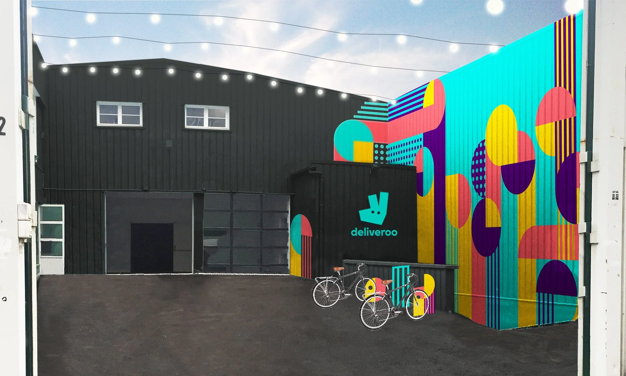
I designed sites in over seven countries. Some are delivery-only while others offer click and collect. From designing a simple doorway for a high rise on the bustling streets of Hong Kong, to murals in Paris and shipping containers in a London car park, each challenge was as unique as the restaurant collection housed within.

Site facade – Hong Kong
This site is situated in Aerosol Alley, Windsor, Melbourne. I worked with the Australia team to brief Conrad Bizjak. Conrad was one of the street artists involved in the initial transformation of the area in 2012, I set him a brief aimed at balancing commercial needs with artistic integrity

Chef portraits – Melbourne Editions

Site concept – Paris

Final mural – Paris


Abstract Poplar landmarks – London
The Singapore site is located in a very grey business park. My research showed Singaporeans love colour.
I designed vinyls to splash the site with colour, and added some local Singlish sayings to the shutters on the rear of the site, to provide Instagrammable opportunities to a socially engaged local audience.


“The first thing that surprised us was the warehouse aesthetic. Vibrantly-coloured shutters serving as external walls, with some bearing Deliveroo and Deliveroo Editions logos, offer a welcoming sight to visitors.”
“Some shutters are playfully adorned with Singlish phrases such as “Makan time!” and “Die die must try!”, radiating a strong local flavour accompanied with an overall minimalist look.
With the opposite facade bearing an equally striking design, not finding the location on your own is close to impossible.”
– Business Insider, Singapore
